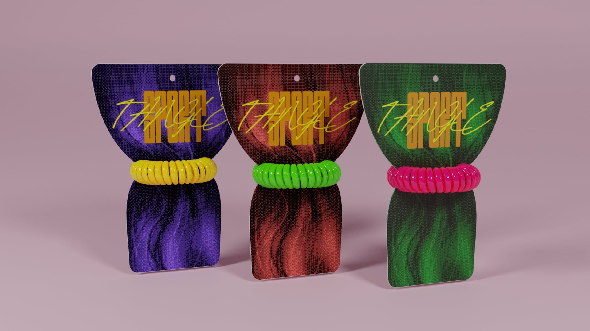
Tangle Sport
- Date — June 2021
- Role — Branding Design, Packaging Design & Illustrations
- Software — Blender 3D, Illustrator, InDesign, Photoshop
Tangle Sport is a packaging design concept to reinvigorate the humble hair tie. Now that 90s and early 2000s nostalgia is in, it’s time to dip back into the neon history of the scrunchie with a modern twist. Ideally staged at cash wraps and as an impulse buy, this packaging would appeal to Millennial and Gen-Z markets looking for something sporty and fun.
Project Goals
This concept was a chance to explore shape-language for packaging and try some unusual techniques reminiscent of the neon trends from the 90s. I wanted to move beyond the standard, minimalistic, and utilitarian cardboard rectangle typically used for hair ties and use a shape that was more tactile.
Solutions
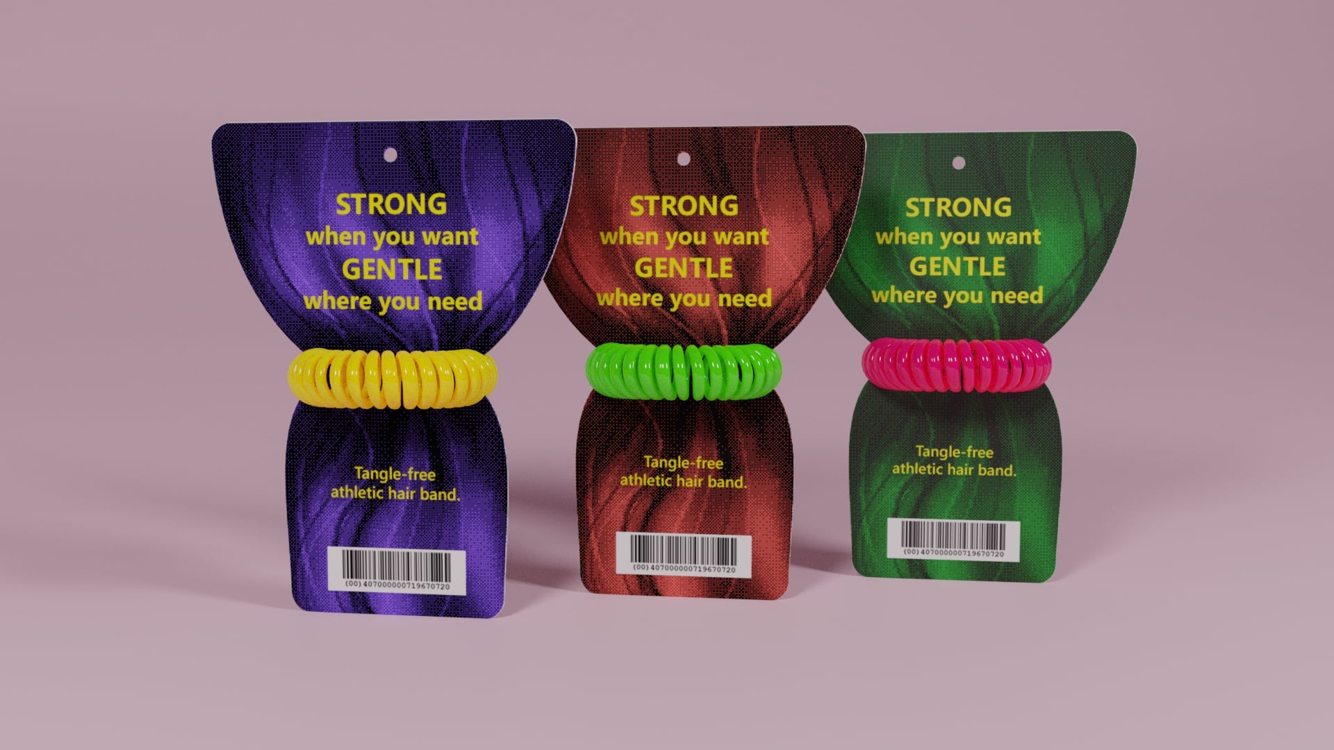
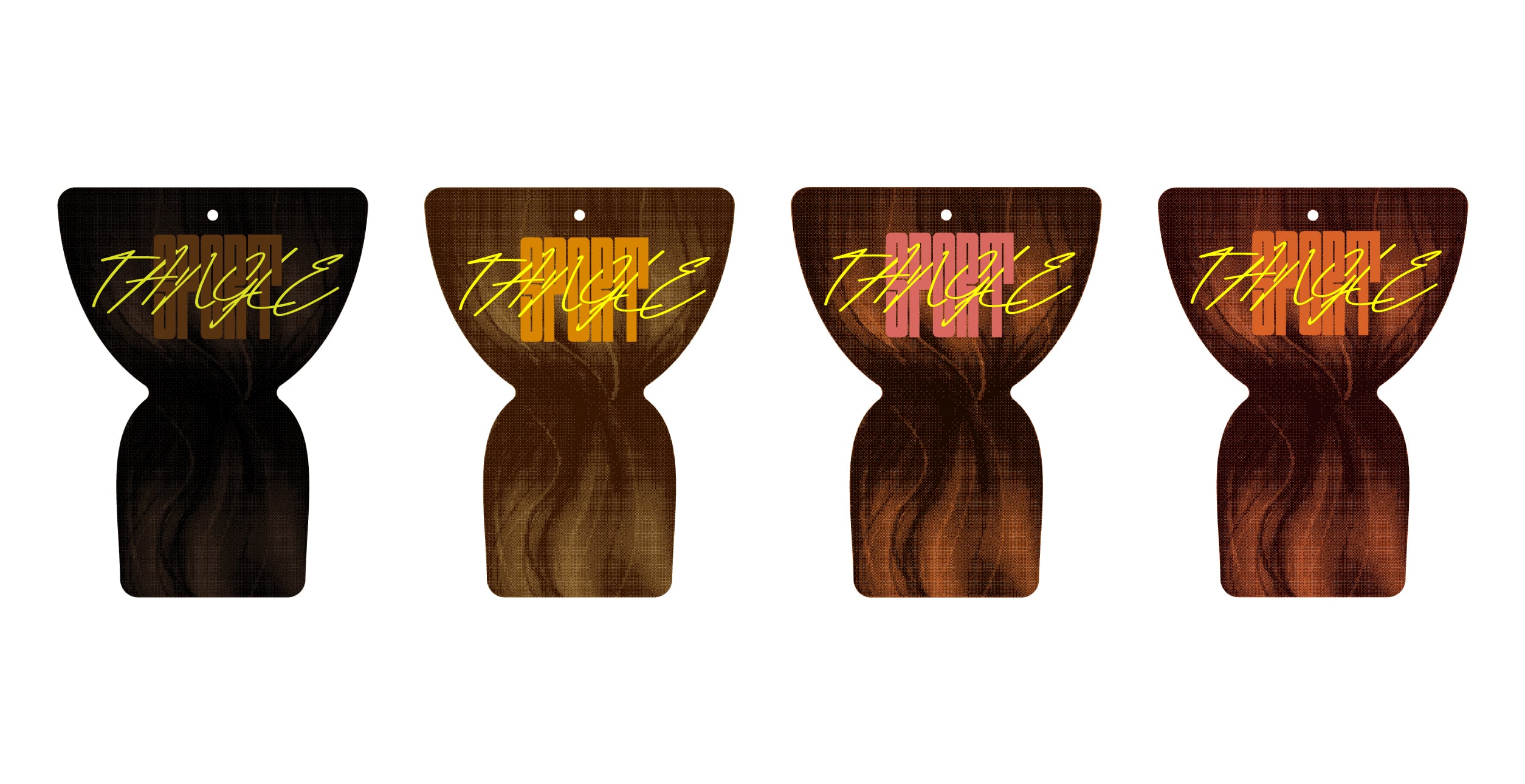
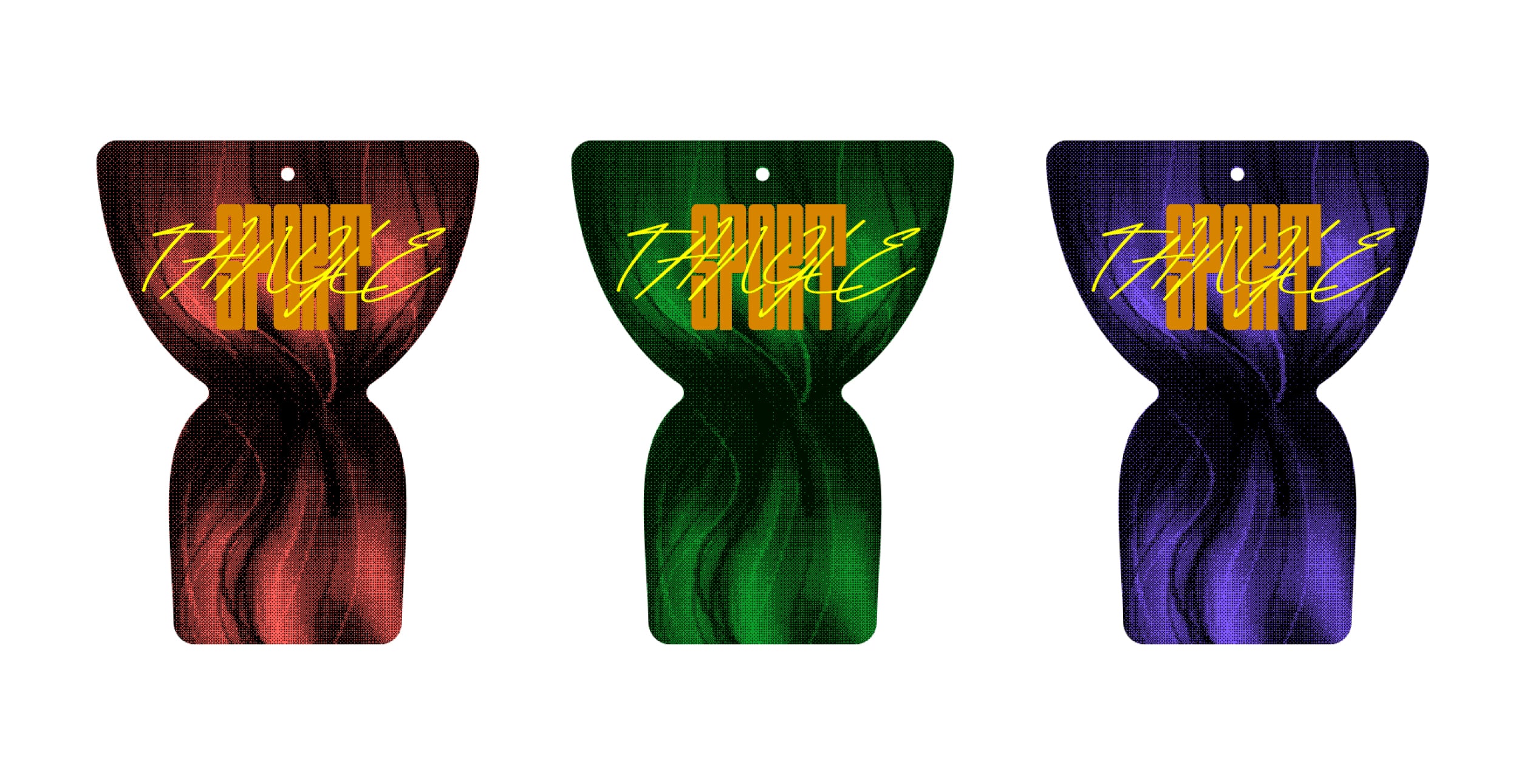
A small series of ponytail-shaped packages in bright colors that compliment and highlight neon spiral hair ties. This style of hair tie was selected for its gentleness on hair and its grip and hold for athletic activities. This mini-brand's motto is 'Strong when you want, Gentle when you need' — a perfect description of this product.
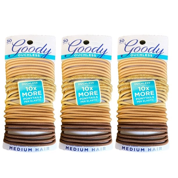
Fairly non-descript and utilitarian.
Not exactly something impulse-worthy.
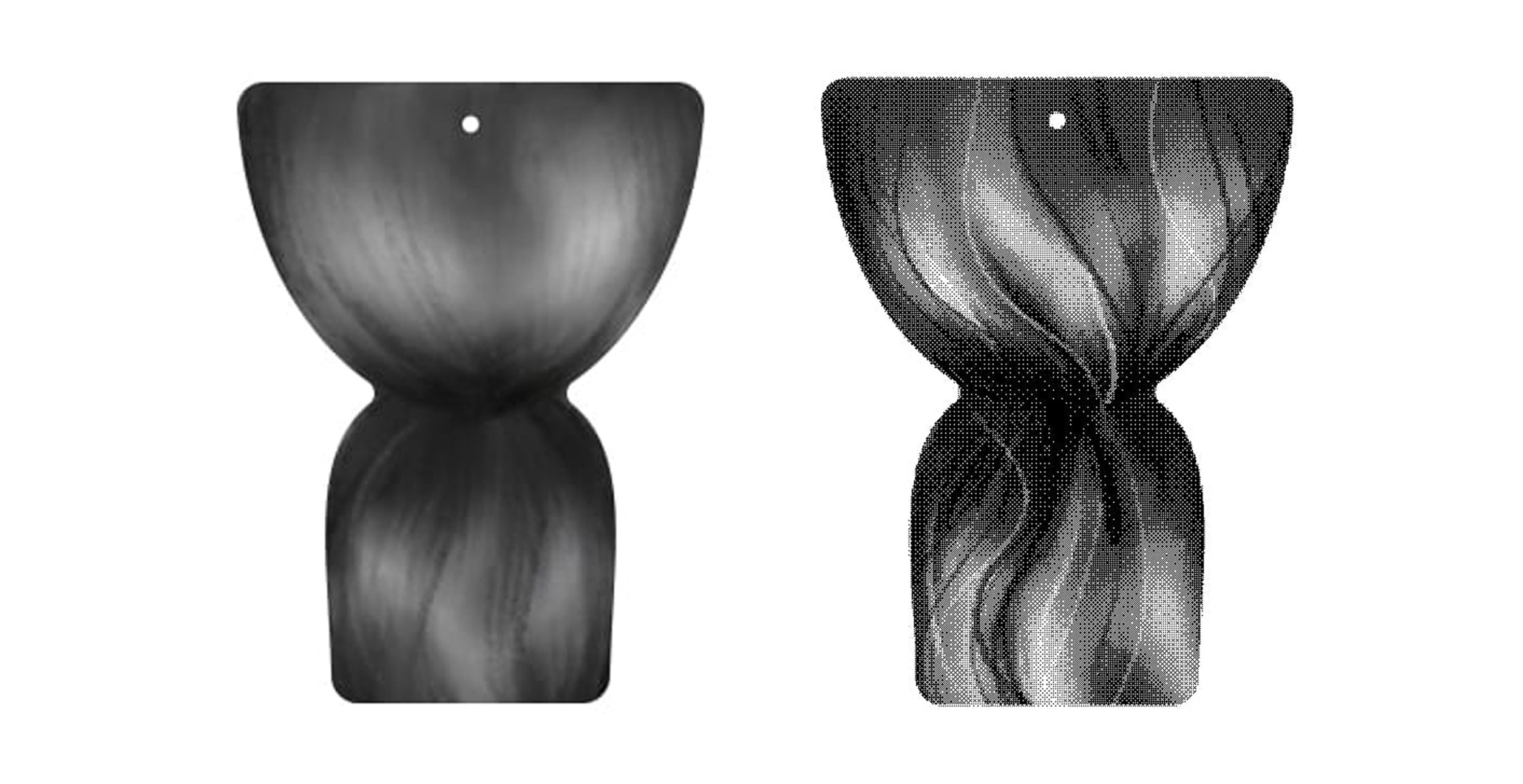
My first goal was to move away from the standard shape most hair ties and scrunchies used. I wanted something reminiscent of a ponytail. Selecting a shape that implies and compliments the grip of a hair tie creates something more appealing and playful.


Just reminiscent enough but appealing on its own.
The next goal was to create a text treatment for the brand that would lean into 90s/2000s nostalgia trends. Something with contrasting weights and reminiscent of the shapes of flowing hair would be a goal. It also needed to be something that would look at home on the package's shape. The final typefaces used were Revive 80 Smooth Signature and Outward Block.

To test the visibility of the text and properly select a color palette, I created a stylized texture illustration in Photoshop and crunched it into a bitmap for a retro vibe. It needed to be adjacent to hair without falling into a photorealism trap.
Initially, I selected a color palette using natural hair colors. However, when grouped together, they just didn't appeal and looked boring. Instead, I opted for a bold 3 color scheme of deep red, electric blue, and tropical green. Using non-natural hair colors removes any concerns of coding and elevates the product.

To complete the concept, I modeled the packaging and coiled hair ties using Blender 3D. The packaging die-cuts were brought in as SVG files and modeled from those paths. The imagery was brought in as high-quality PNG images and used as UV textures. Both fronts and backs of each color concept were created. Final images were rendered with Cycles.